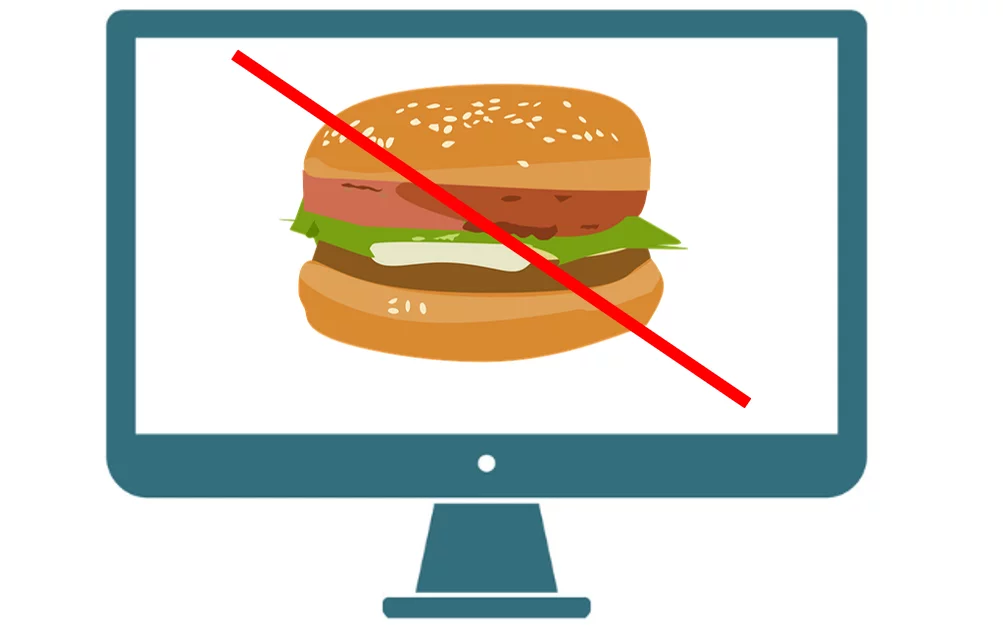
Hamburger icon menus are ubiquitous on mobile sites and for very good usability reasons. They yield precious visual real estate that a full display of navigation would require to other important elements on the mobile web page. Visitors also now expect to see a hamburger menu either in the upper right or left portion of the mobile web page and are accustomed to and comfortable using these for navigation. So the issue of their usage on mobile is not highly debated. However, there are also many desktop sites that incorporate the use of a hamburger menu either in place of, or in addition to a separate horizontal navigation, although not necessarily for the same space-saving purpose. Is that a good idea?
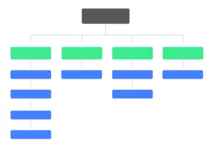
There are both form and function aspects to the hamburger menu. In terms of strictly form, for desktop, they can be much more aesthetically pleasing than a traditional horizontal navigation, allowing the designer to create a perceptively cleaner design above the fold unencumbered by visually distracting text. For function, hamburger menus exist for purposes of navigation and exposing the taxonomy of content on a site.
Usability Issue #1 – Increased physical interaction cost
It’s important to note that visitors to your site will tend to be required to expend 3 different types of effort during their visit experience:
- Cognitive – the use of their reasoning and thinking skills to make decisions
- Visual – the use of their visual systems to organize and visually decipher the content on a page
- Physical – the use of hands, fingers, and thumbs to click, tap, scroll, move their mouse and type from a keypad
Typically, since visitors are looking to accomplish their visit goals with the least amount of combined effort, minimizing interaction costs leads to improved engagement and conversion.
So, the first usability issue with hamburger menus on desktop, is the increased physical interaction cost incurred due to that extra click required every time a visitor wants to use the site navigation to get to a different page. Consider that some of your more engaged visitors may visit up to 6 or more pages and may navigate throughout your website primarily via your site navigation. Hiding site navigation behind a hamburger icon on desktop may require 6 or more additional clicks just to navigate.
Usability Issue #2 – Reduced discoverability
The second usability drawback on desktops is related to discoverability. Discoverability is defined as the ability to quickly ascertain and mentally inventory the available content and taxonomy on the site. Many first-time visitors look at the navigation links to understand the structure of the site and determine what type of content is available. They may even create a mental itinerary prioritizing the order of pages they plan to visit. Hiding the navigation behind a click reduces discoverability. No longer can visitors see the structure and content at a glance and without clicking their mouse. Additionally, since hamburger menus hide these visual clues, they force visitors to remember the structure and content of your site increasing cognitive interaction cost.
Usability Issue #3 – Reduced findability
The third usability problem with navigation hidden behind a hamburger icon on desktop websites is findability. Findability is the ease of locating or finding a specific item of interest. For example, a visitor to an attorney site may want to quickly read about the firm’s qualifications and credentials. The process of finding this information is made easier by visually exposing an “About us” link in the top navigation. Findability is reduced with hamburger menus on desktop as it requires an additional click to even determine if that page is available.
Are there any times when a hamburger menu on desktop is recommended?
Other than purely aesthetics, there is one use case where a hamburger menu could actually improve usability on a desktop site. Usability on sites that have an overabundance of categories and content (or SKUs) may benefit form a hamburger icon. For instance, Walmart and Amazon deploy a hamburger menu out of necessity due to the size of their site. On the other hand, Target, despite their number of SKUs, still uses a traditional horizontal nav and placed product categories under a clearly marked “Categories” navigation link.
Summing it all up
As a digital marketer, the decision to go with a hamburger menu on desktop comes down to balancing the pros and cons or tradeoffs of form over function. In situations where aesthetics trumps usability, hiding navigation from your visitors may be warranted. We recommend, though, using a healthy dose of visitor empathy and consider not only the goals of your site, but also the goals of your visitors when choosing how to display your navigation.
To learn more about CRO & best usability practices, view our 12 CRO Tips to Get Your Business Thriving in the New World or contact us today!


