As marketers, our goal is typically to maximize the return on our ad spend. Sometimes the goal of our marketing initiatives may be tied to brand awareness where we use evaluation metrics including brand reach, brand recall, social media mentions and impression share. More often, though, we’re more driven by conversion – guiding a visitor to our site and transforming them into a lead or customer.
Some 20 years ago, as digital marketing matured from a state of infancy to a more exploratory toddler state, marketers theorized that they might be able to increase conversion by landing a visitor on a specially-designed page versus the homepage. This landing page would have a greater visual and messaging emphasis on the action the marketer hoped the visitor would take. This approach many times also featured a page void of navigation under the belief that by giving visitors no options other than the “action” on the page, that visitors would have no other choice but to complete the action. “We don’t want our visitors to go to other pages … we want them to fill out the form”. And just like that, we can increase conversion, right?
Well, not so fast. The general theory is quite plausible except for it ignores 2 glaring issues: First, is the expectation that the visit experience happens in an internet vacuum, where the visitor has no other websites they can visit. In essence, the marketer assumes that when a visitor arrives on their landing page from say a paid search ad, that somehow the browser’s back button ceases to exist. It’s usually safe to assume that your web visitors have less time than you may think and less patience than you may think. If your visitors can’t meet their predetermined need on your site in an expeditious manner, the easiest (and perceived quickest) path to meeting that need may be to try a competitor’s site via the browser’s “back” button. It doesn’t really matter if you’ve given the visitor only one choice on your site. If they’re not ready, their mouse will seek out that other choice, the “back” button.
The other glaring issue focuses on the marketer’s lack of awareness of visitor intent. It’s predicated on the false assumption that the visitor is always ready to become a lead or customer with just the right type of influence … or big form … or big button. As much as our job as marketers would be easier if this were the case, it’s unfortunately not true. Depending upon the product or service and the risks and ramifications of making a wrong decision, the research-decision continuum for visitors can entail numerous touchpoints and mini-goals over an extended period of time. Unless you know what the visitor is hoping to accomplish in their visit and where they most likely are in the funnel, presenting them a bottom of funnel only alternative will backfire.
In paid search, there are clues as to where the visitor is in their research-engagement continuum based on the keyword phrase used. As a general rule, you can expect that longer-tail, more specific keyword phrase searches could be from visitors who’ve done previous research and may be further in the funnel and more knowledgeable as opposed to searches using very general terms. If nothing else, the longer-tail keyword may give you important insights into the specific details the visitor will be looking for; insights that could drive the design and messaging of an effective landing page that would immediately resonate with this visitor.
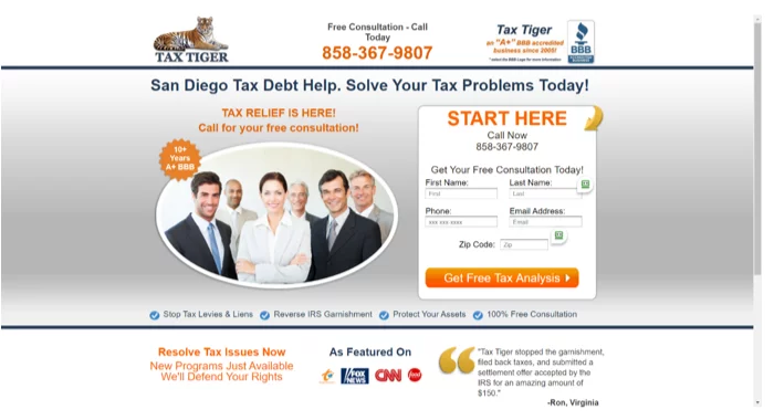
Let’s take a look at an example. Here’s a search and visit experience that may not be reaching its conversion potential. I searched on the general term “tax attorney” and clicked on a Google ad to reach this page.
Because of the general nature of my search term, this business has no real clues as to the nature of the problem I’m trying to solve, or the type of information I need to narrow my choices. So, the marketer’s assumption on this landing page is that since I can’t navigate off this page and since my only option appears to be to fill out a form, that I will indeed take that action of providing personal information in exchange for a free tax analysis. But what if I don’t need a tax analysis? What if I want to know if they deal with my unique situation … do they handle corporate or personal tax clients … what are their qualifications … what type of tax law do they specialize in … how long have they been in practice … is my case too large or small for them? How willing will I be to provide my contact information and invest the time to speak with a firm that has given me little indication it’s a good fit. Simply providing prominent navigation to a “services” and an “about us” page would certainly help me answer those questions, and perhaps make me feel like filling out a contact form is the best next step for me. In fact, in instances where the marketer has given no clues as to any visitor specifics, why would a well-designed homepage that has panels of top-level information and navigation to information-rich content not provide a better visitor experience?
And, finally, depending upon the level of complexity of your service, there’s also the issue of trust – how comfortable will visitors be with a firm when they see an aggressive attempt to convert that seems out of line for that type of industry? Is that form really appropriate for this type of service? Finally, the main messaging on this landing page – tax debt help – is mismatched with my need, which based on my search query is researching qualified tax attorneys.
Now let’s consider a different example. If I search on “small business tax attorney”, I’ve given the marketer a couple clues. First, is that I may recognize that there may be something different about tax attorneys who specialize in small businesses versus larger businesses versus individuals. Perhaps I’m a little further down the research funnel. Additionally, I’m telling you what’s important – I want an expert who handles small business tax law matters. By creating a landing page that prominently tells me that this is an area of specialization, you’ve answered my most pressing question and I may be more willing to complete a contact form. Interestingly, enough, of the top 5 ads shown in Google for that search term, none took advantage of the opportunity to include mention in the ad copy, nor the landing page of “small business”.
Landing pages can be enormously powerful tools in increasing lead generation. And the true test of the effectiveness of landing pages is determined by testing. We’ve seen many companies (mostly smaller, although some larger companies are equally guilty) roll out landing pages without taking the time to create and implement a proper testing strategy. The combined impacts not correctly testing landing pages, along with the assumption that a bottom-of-funnel landing page approach will always work can shut down conversion.
The great falsehood of landing pages can make it easy for marketers to think that a landing page will always out-convert a homepage and should be blindly implemented without a test. It can make it easy for marketers to adopt a lazy approach that centers around the marketer’s goals, which may not be in alignment with the visitor goals. The antidote to that falsehood is recognizing how much you’ll know about the visitor prior to showing your page and testing a relevant landing page experience that’s appropriate with visitor goals and where they likely are in the funnel. In situations where there are few clues, you might find that homepages engage and ultimately convert better. Effective landing pages are more than just a big prominent form, stripped out navigation and a big button with an aggressive directive such as “Start Here”. They should be viewed as a visitor-centric tool, designed for your visitor, their needs, level of knowledge and objective, that guides them through the funnel and makes it easy for them to convert. Take care of your visitor and your visitor will take care of your conversion.
For more conversion optimization insights, contact us!


