Today’s ecommerce retailers must ensure that they’re providing an optimal mobile experience for their customers. That’s why we’ll show you real-world mobile ecommerce examples featuring cart and billing page best practices that will help you drive more conversions.
1. Provide Paypal checkout option on your cart page
Paypal has become an almost universal method of payment on most ecommerce stores today. Typically, Paypal payment options are displayed on a billing page. But why make your customers wait to checkout with Paypal, when they can do so directly from their cart page? Giving customers the option to checkout with Paypal earlier in the checkout process reduces the additional step (or interaction cost) they need to take to proceed to the billing page which includes fields they don’t need to fill out anyway such as credit card number, expiration date, security code, billing address, etc.
Ecommerce retail giants like Crutchfield are employing this strategy and we think that it’s working. On Crutchfield’s cart page below, you’ll see in this mobile ecommerce example that the Paypal checkout button is prominently displayed directly beneath the normal checkout button. Furthermore, the use of yellow and the Paypal logo make it easy for users to recognize what this unconventional button will do, reducing any possible cognitive effort for users to try and guess what the button is for.
By reducing the number of steps a user must take in order to complete a transaction, you’ll be able to increase the likelihood that they’ll convert by making the checkout process easier.
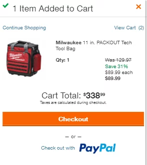
Consider also placing your Paypal checkout option directly on a popup cart (see how Home Depot does it above?) to streamline your checkout process even more for Paypal users.
Speaking of popup carts….
2. Use Popup Carts to Increase AOV
Most ecommerce retailers today utilize popup shopping carts which appear once a user has added an item to their cart. However, there are many ways to optimize popup carts by including elements outside of just Checkout or Continue Shopping buttons.
Popup carts present the perfect opportunity to include elements that will help increase Average Order Values (AOV) in two ways.
- Advertise accessories or packages that accompany a selected product
- Progress indicator for free-shipping eligibility
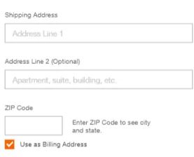
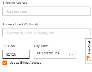
- Prepopulate City and State based on Zip Code
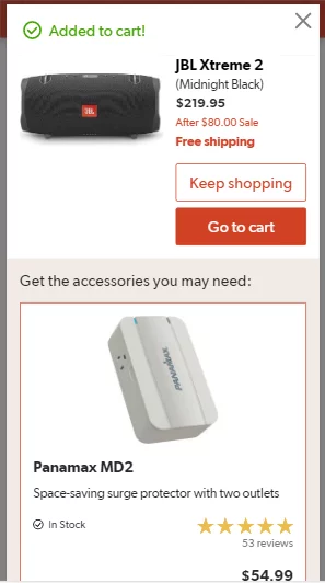
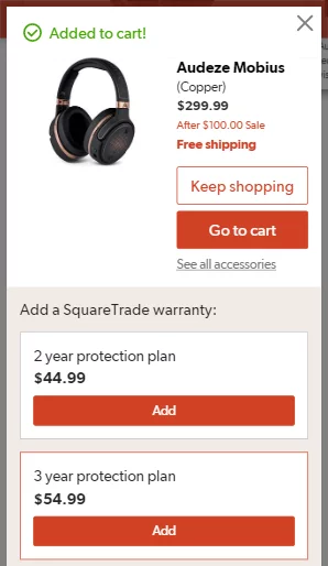
Elements that accompany a selected product such as recommended accessories or warranty/protection plan packages, are a great way to increase AOVs. By presenting these elements early on within the popup cart right when the user has selected the item, you’ll be able to capitalize on the opportunity to upsell these items when the customer’s interest is greatest. Presenting these options later on in the funnel, such as the actual shopping cart page, the user’s mind may have already shifted into a transactional mindset where they may be more hesitant to spend more money for items they think they might not need. Crutchfield provides great mobile ecommerce examples below by recommending both warranty packages and accessory products in their popup cart pages.
The popup cart is also a great opportunity to let users know how close they are to qualifying for free shipping. Everyone loves free shipping, which is why it has pretty much become a norm for most ecommerce websites as a means to increase customers’ order values.
Applying a simple, customized message on the popup cart page such as “You’re just $20 away from getting free shipping on this order” can potentially increase the likelihood that customers will continue to shop.
Furthermore, consider testing applying the two strategies described above into your popup cart. For example, if a customer is just $20 away from qualifying for free shipping, consider recommending products or accessories that are priced at $20 for users to add to their cart directly from the popup and proceed to checkout.
The secret sauce to creating a mobile-friendly checkout process is to reduce the interaction cost required of users in every single step.
That’s why this is one of our favorite elements that every mobile checkout process should have. By dynamically populating fields wherever you can, you’re reducing those extra fields for users to manually fill out. The billing page is the page that requires the most manual inputs for name, address, billing address, etc and can be the most tedious part of the checkout process. Therefore, there are multiple opportunities to reduce steps on this page alone.
The easiest way is to dynamically populate city and state fields based on the zip code a user has inputted. For this to work, the zip code field must come before the city and state fields on a billing page. It may seem unconventional, but users will appreciate it when they see that their city and state are automatically filled in. It’s important to note that although these fields will be populated, they should still be editable fields to allow users to change their city in the rare occasion that the zip code pulls an inaccurate one.
You can see this in action on Home Depot’s billing page. In the screenshot above, you’ll notice that they include only two address fields on default: the street address and zip code. Once the user inputs a zip code, city and state are automatically in a field that appears to the right.
Although this may seem like a small change, it is the accumulation of small iterative improvements like these can make the difference between an abandoned cart and a sale.
4. Use manual inputs for credit card expiration dates vs dropdowns
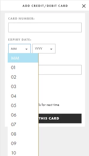
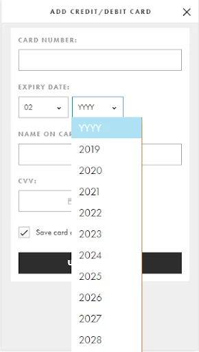
This is another small change that can easily be implemented on your mobile billing page. We’ve seen many cases where mobile billing pages will utilize dropdown menus for month and year fields for credit card expiration dates. Since there are 12 months in a year, and options for years can span decades, these dropdown menus are very long and are cumbersome for mobile users to attempt to navigate on a small mobile screen.
To select an expiration date with this setup, a user must first tap on the month field, and scroll through the long list without accidentally tapping on the wrong month. Once that’s selected, they then need to tap on the year field to repeat the process again resulting in a process that costs six steps without considering accidental taps on the wrong dates.
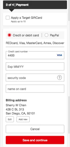
A simple solution to this lengthy process is to use manual inputs instead in a single step. Typing in a total of four digits for month and year requires much less effort than navigating long dropdown menus. See the comparison below between Asos and Target below , which would you prefer?
Asos’ billing page featuring dropdowns
Target’s billing page featuring mobile-friendly manual inputs
5. Use progress indicators to let users know where they are at in the checkout process.
The checkout process is probably the most important area to keep your users engaged. This is why it’s so important to include progress indicators throughout every step to reassure users where they are in the checkout process. For example, if users can see that they are just one step away from completing their transaction, filling out all the required fields on a billing page doesn’t seem so daunting after all.
If you’re looking for ways to increase your sales, consider following in the footsteps of today’s top ecommerce retailers like the mobile ecommerce examples presented here by testing these five tactics. Not sure where to start with your ecommerce A/B testing roadmap? Contact us to see how we can help you increase your conversions.
