Case Study
Case Study
King Schools
Company: King Schools - private pilot courses
Industry: E-Commerce
Goal: Increase in Sales
The Result
76% Increase in Sales by Reducing Visitor Interaction Cost
About the Project
King Schools specializes in aviation training, and for over three decades has been a leading producer of computer-based aviation courses and interactive software. They were in need of a redesign of their core offerings. The task was to create a new category page and product detail pages for their “Private Pilot” exam section with emphasis on driving people to the “Get It All” package.
Project Roles
Supporting in wireframes and user experience and lead on visual skinning of wireframes (while maintaining consistency with client’s existing website look and feel).
Research and Goals
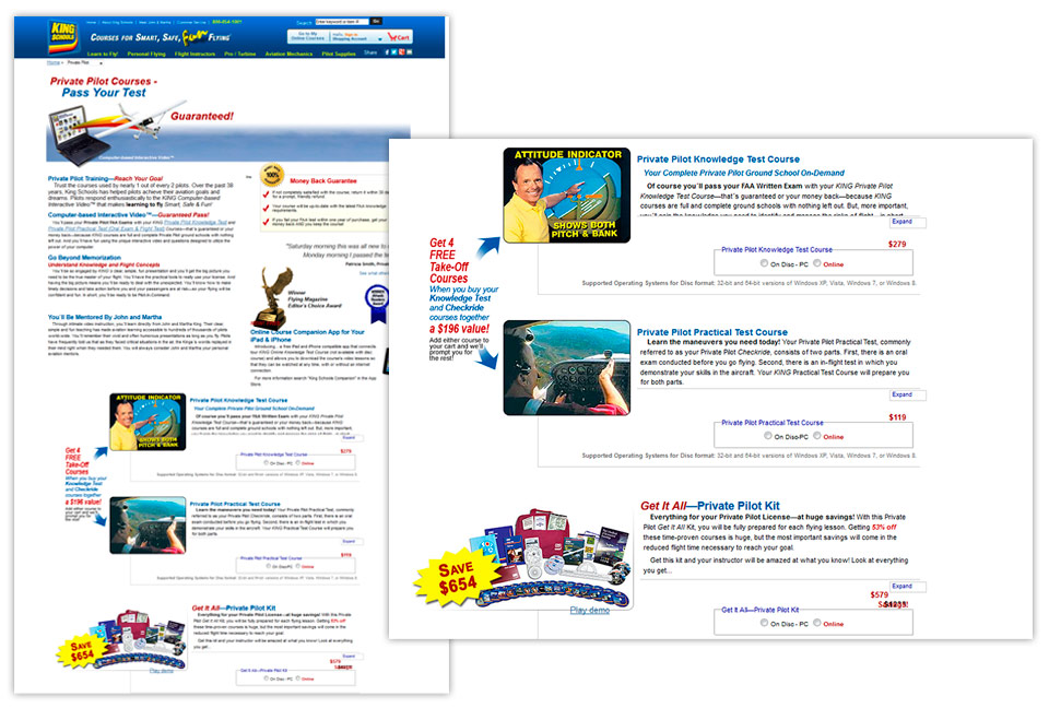
The main hurdle on their current page was the confusing layout visitors had to navigate in order to find, differentiate and choose between the three private pilot course offerings. Any difficulty in finding and choosing a course option would obviously affect the ability for a visitor to add anything to their cart, and would have a negative impact on sales. Priority was given to the task of quickly educating the visitor about the different offerings, followed by framing the options in a way to drive more traffic (and conversions) to the “Get It All package”.
Discovery
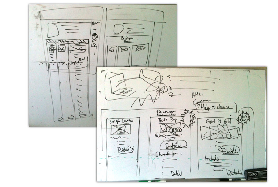
In addition to the three course options was the ability to make a custom bundle (see green circle). This was a confusing interaction that inserted another level of complexity and a potential roadblock within the flow of choosing a course option.
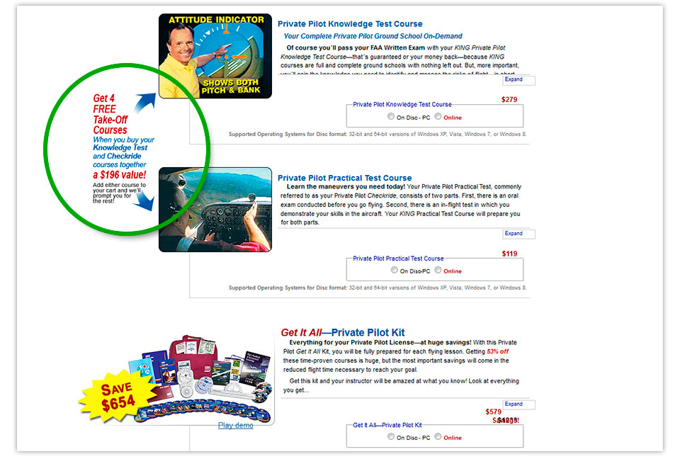
By walking the stakeholders through this confusing option allowed them to experience the task as a customer, and resulted in the solution of removing this option.
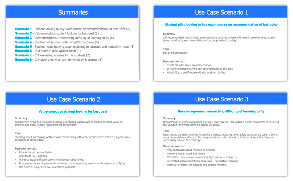
Scenarios
Scenarios were designed to represent the most common roles, motivations and tasks of their visitors, ensuring that the new designs would effectively meet their needs.
Whiteboard Sketching
After research and discovery, our team started with some whiteboard sketches to clarify our understanding of the tasks of the landing page.
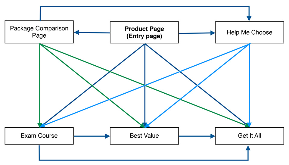
Navigation Flow
The visitor needed to be able to easily view and compare all offerings, and be presented with up-sells at appropriate times. This served as a reference for both the client and for us throughout the project.
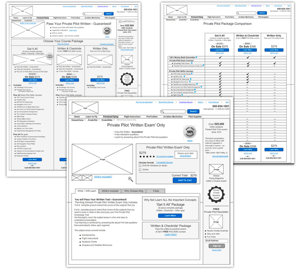
High-fidelity Wireframes
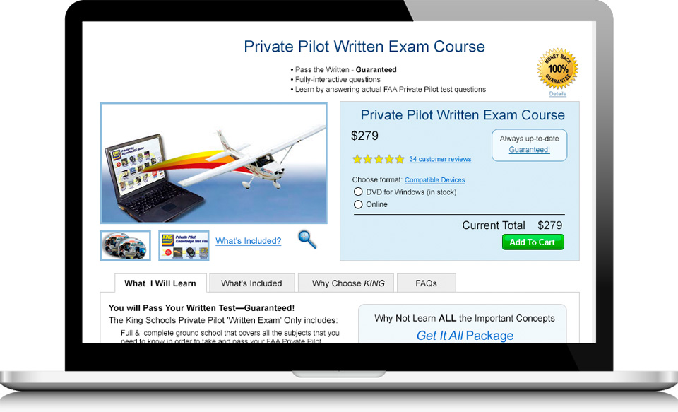
Detailed wireframing followed, consisting of more meaningful content and messaging. To address the original confusing presentation of the different course options, the new layout proposed side-by-side vertical presentation of the the 3 bundles (with the inclusion of a “Help me choose” option and comparison page). The hypothesis proposed that changing the layout encouraged easy product comparison and selection. We also introduced separate product detail pages; with the goal of presenting an uncluttered layout with clear images, description, reviews, pricing and call-to-actions giving the visitor the information and motivation required to move forward with their task.
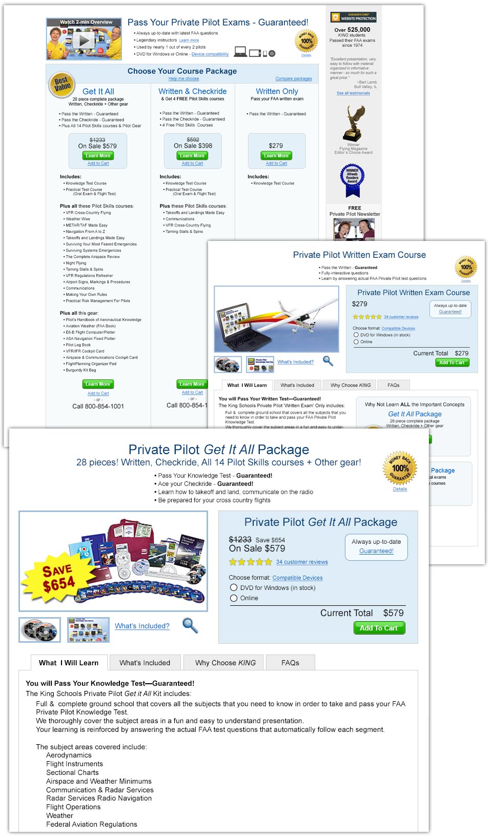
Visual Design
The final wireframes were converted into graphic design mockups that maintained consistency with client’s existing website look and feel. Any changes to the current site style guidelines and information architecture were out-of-scope; the new content was meant to fit within the current site. Landing page and product detail pages.
The Result
Results – 76% increase in sales
Based on sales comparison of the previous year, the amount of people signing up for the “Get It All” package rose 76% after the new pages were implemented. Since the implementation, the gain has stayed consistent. The client has been individually updating sections of the site with the layout of the new category and product detail pages.